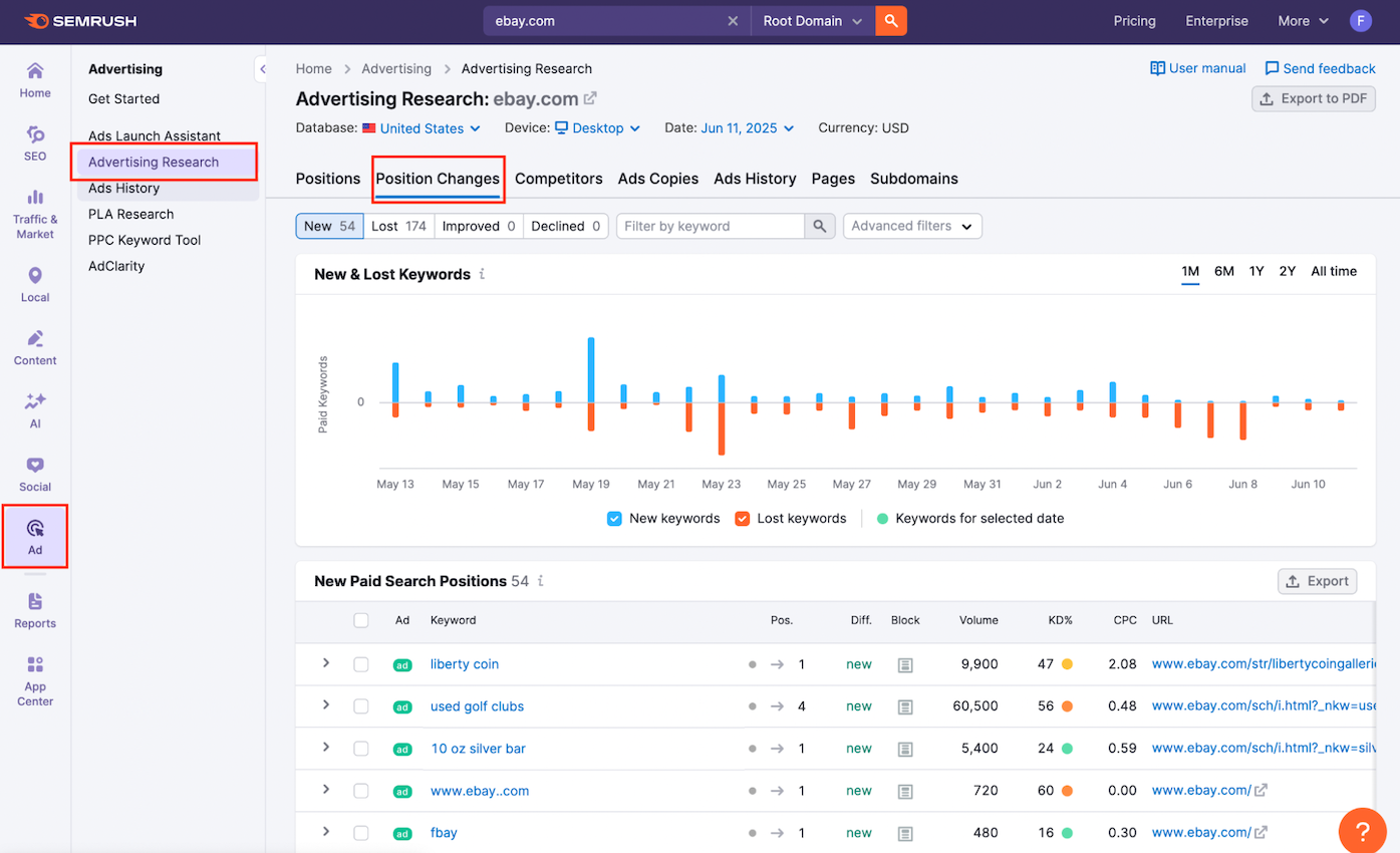
The Position Changes report is part of Advertising Research shows how a domain’s Google Ads campaigns are evolving. It’s your go-to feature for spotting signs of strategic change, such as fresh campaigns, abandoned keywords, or shifts in budget priorities.
This report breaks down keyword movement into four categories:
- New: Keywords for which a domain’s ad have just started ranking
- Lost: Keywords for which the ads have disappeared
- Improved: Existing keywords that have moved up in the rankings
- Declined: Existing keywords that have dropped in position
Whether you’re watching a key competitor or auditing your own paid campaigns, this report reveals which terms are gaining visibility and which ones are falling off. It also provides key context like CPC, keyword difficulty, volume, and the ad’s destination URL.
To access the report:
- Open the Advertising Research tool from the Semrush sidebar.

- Enter a domain into the search bar.
- Click the Position Changes tab to explore how that domain’s keyword visibility has shifted.
Quickly Analyze Keyword Movement With the Graph
The top of the Position Changes report features a visual breakdown of how a domain’s paid keywords are shifting. This graph helps you identify when new keywords are added, lost, or experience rank changes.
Step 1: Search a Competitor’s Domain
Start by entering the domain you want to analyze into the search bar at the top of the tool (you may have already done this via the search bar on the Advertising Research landing page).
Step 2: Adjust Macro Settings
At the top of the dashboard, configure your macro settings. These options influence every data point in the report.
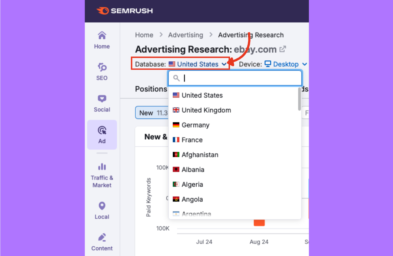
Database
Select the country you want to analyze.
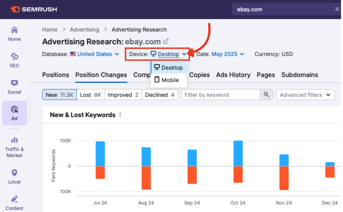
Device
Choose between desktop or mobile Google Ads results.
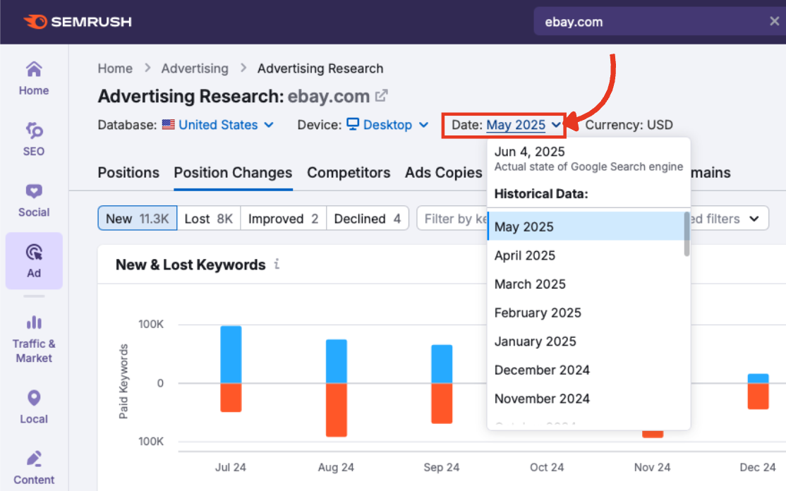
Date
Pick the time period you want to view. You can look back as far as January 2012.
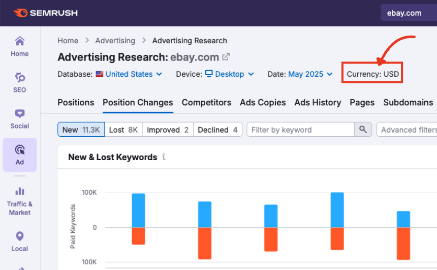
Currency
The currency that CPC and cost metrics will display in based on your selected database.
These settings apply to both the trend graph and the data table below.
Step 3: Understand the Keyword Change Graph
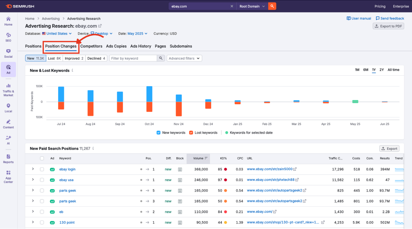
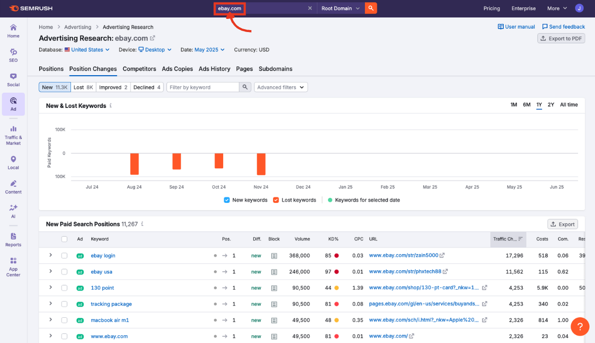
The graph shows how a domain’s keyword list has evolved within the selected period.
Press either New or Lost to display ads appearing for the first time versus ads that dropped from visibility.
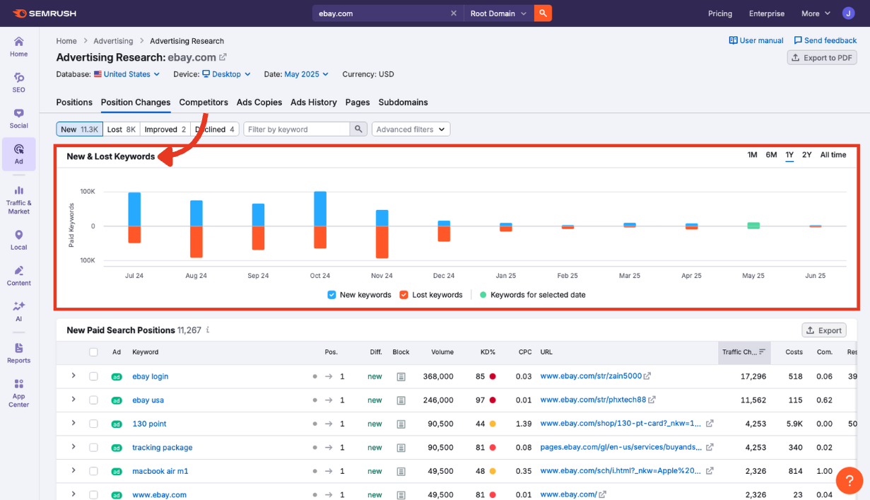
Here’s how to read it:
- X-axis: Dates across the selected period.
- Y-axis: Number of paid keywords.
Bar color meanings:
- Blue: New keywords added (ads appeared where they hadn’t before).
- Orange: Keywords lost (ads no longer appearing).
- Green: Keywords associated with the specific time period selected.
Improved and declined
Selecting either improved or declined shows ads that moved up in rank against ads that moved down.
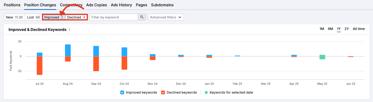
- Blue: Improved keywords (ads that have gained rankings).
- Orange: Declined keywords (ads that have lost rankings).
You can also adjust the timeline using preset ranges: 1M, 6M, 1Y, 2Y, All Time.
These filters also update the table beneath the graph, making it easy to jump from macro trends to detailed results.
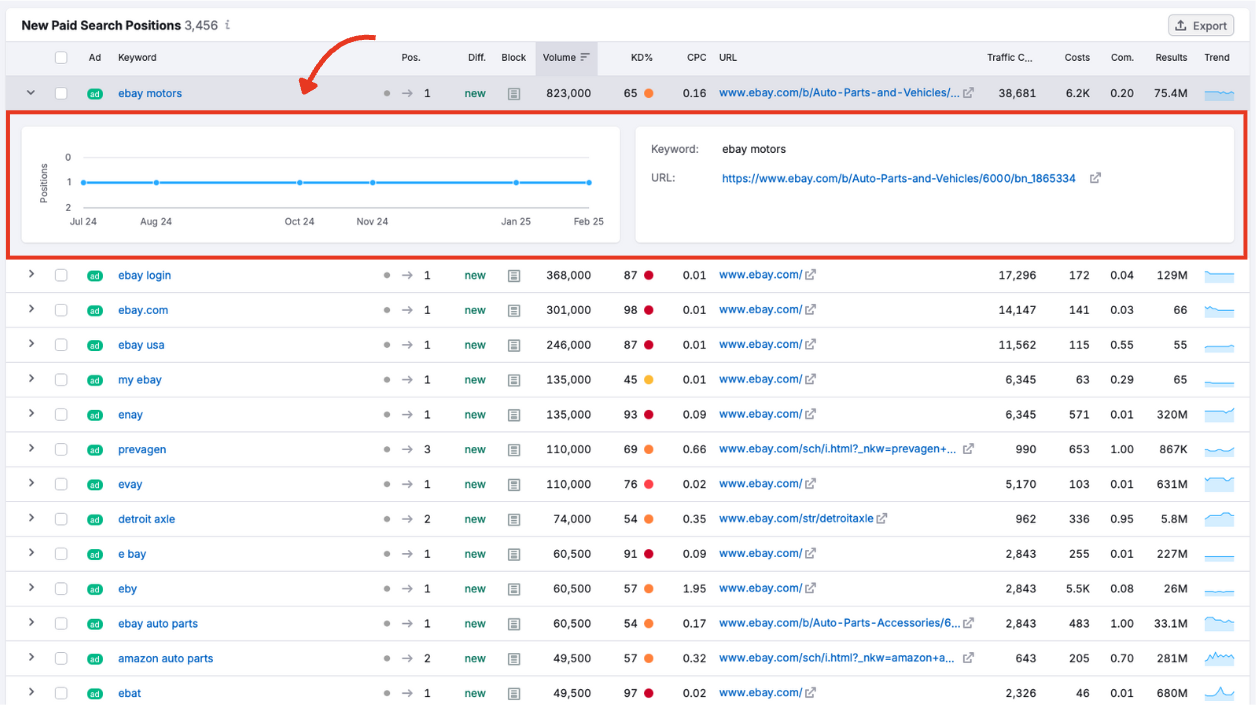
Review the Paid Search Positions Table
Beneath the graph, you’ll find the Paid Search Positions table. This gives you granular data about the domain’s ads, helping you spot tactical shifts, new opportunities, or increased ad spend.
Each row represents one keyword, and each column gives you another layer of insight.
Ad
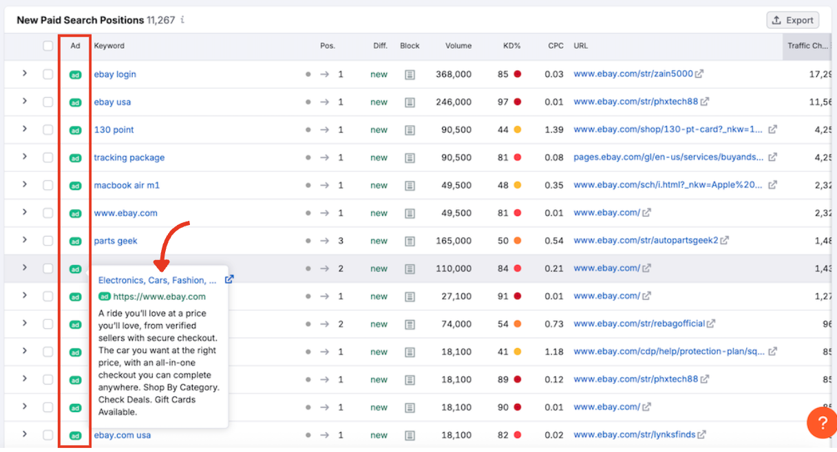
Hover over the green ad label to preview the creative. You’ll see the title, display URL, and a short description. Click the URL to visit the ad’s landing page.
Keyword
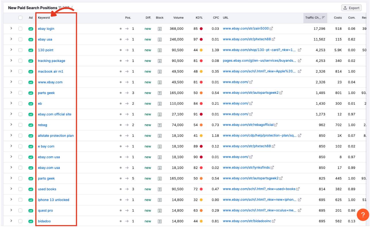
The paid search term that triggered the ad to appear in Google. Click the keyword to explore it in Ads History.
Position (Pos.)
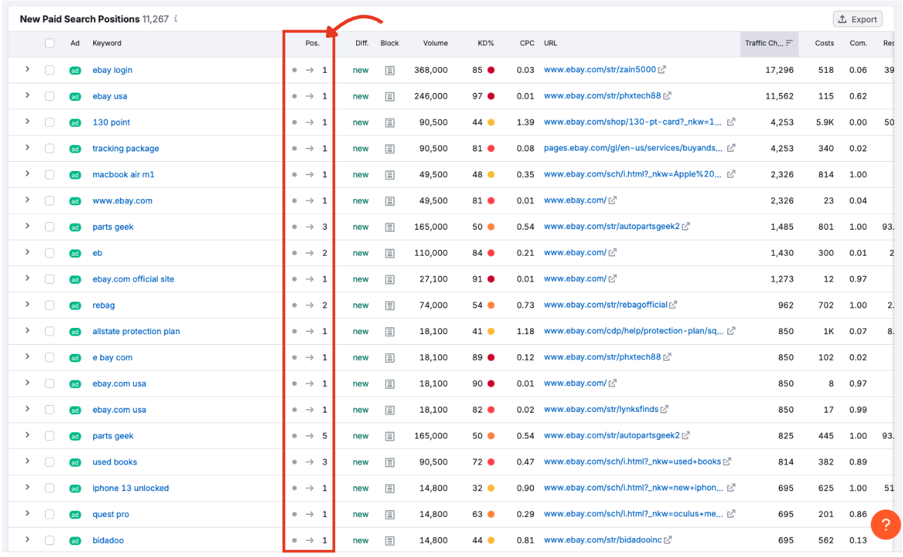
This number indicates where the ad ranks among Google’s paid results. 1 means it appears at the top of the results page.
Difference (Diff.)
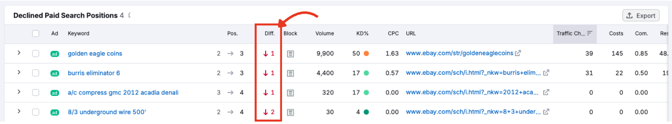
The number of position changes. For new and lost keywords, this field will simply say “new” or “lost” for every keyword. For improved and declined keywords, you’ll see a red (declined) or green (improved) number.
Block
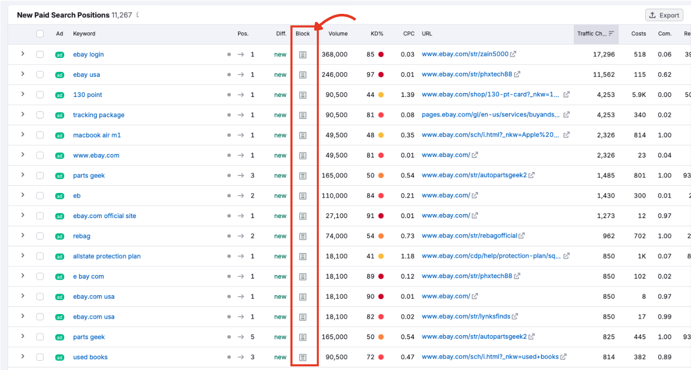
Indicates whether the ad showed at the top, side, or bottom of the SERP.
Volume
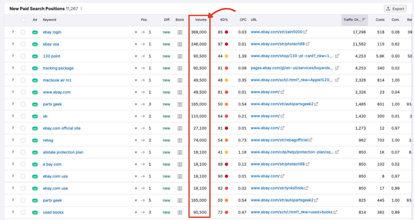
The estimated monthly search volume for the keyword. High-volume keywords suggest broader potential reach, but may be more expensive and competitive.
KD (Keyword Difficulty)
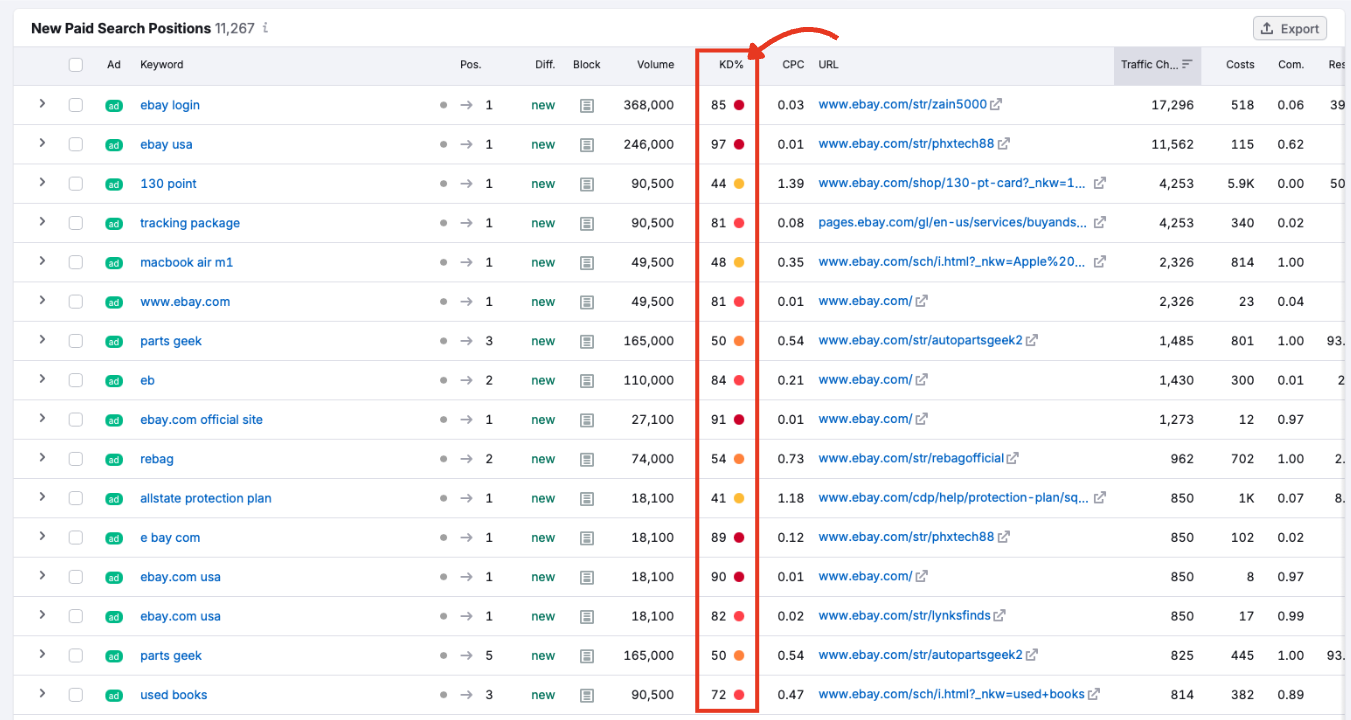
A percentage score that estimates how difficult it would be to rank organically for this keyword. It’s helpful if you’re considering an integrated paid and organic strategy.
CPC (Cost Per Click)
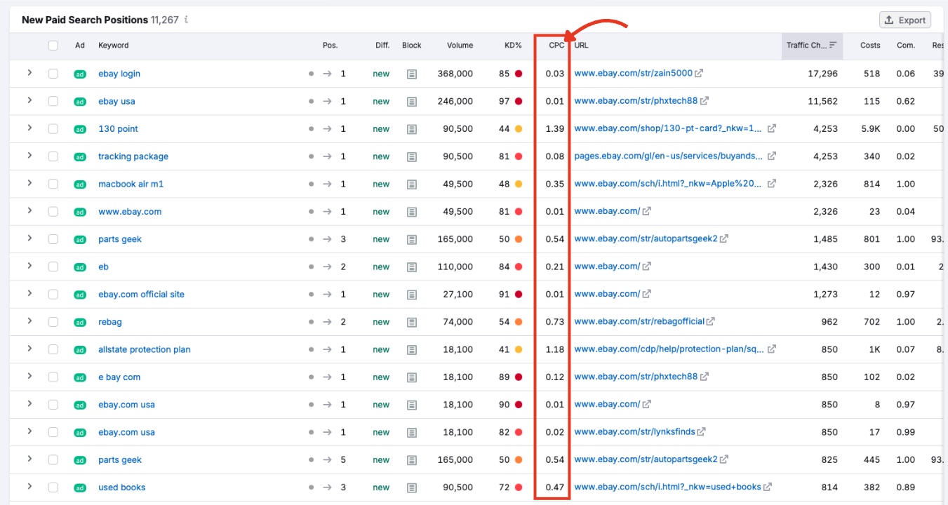
The average price advertisers pay when someone clicks an ad triggered by this keyword. Useful for ad budget planning.
URL
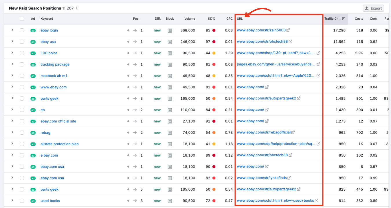
The landing page tied to the ad. Clicking the link opens the live page in a new tab.
Traffic Change
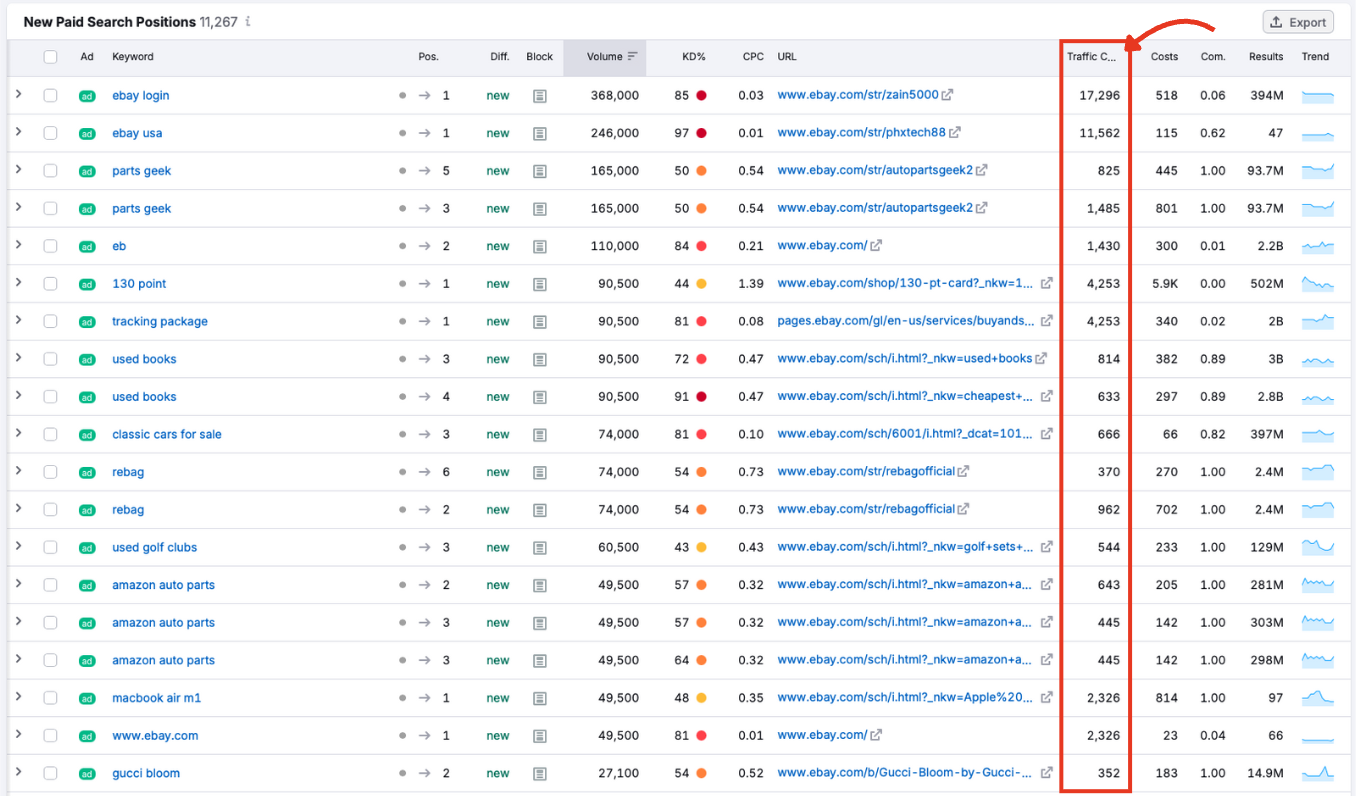
Shows the estimated traffic change as a result of the new keyword visibility status.
Costs
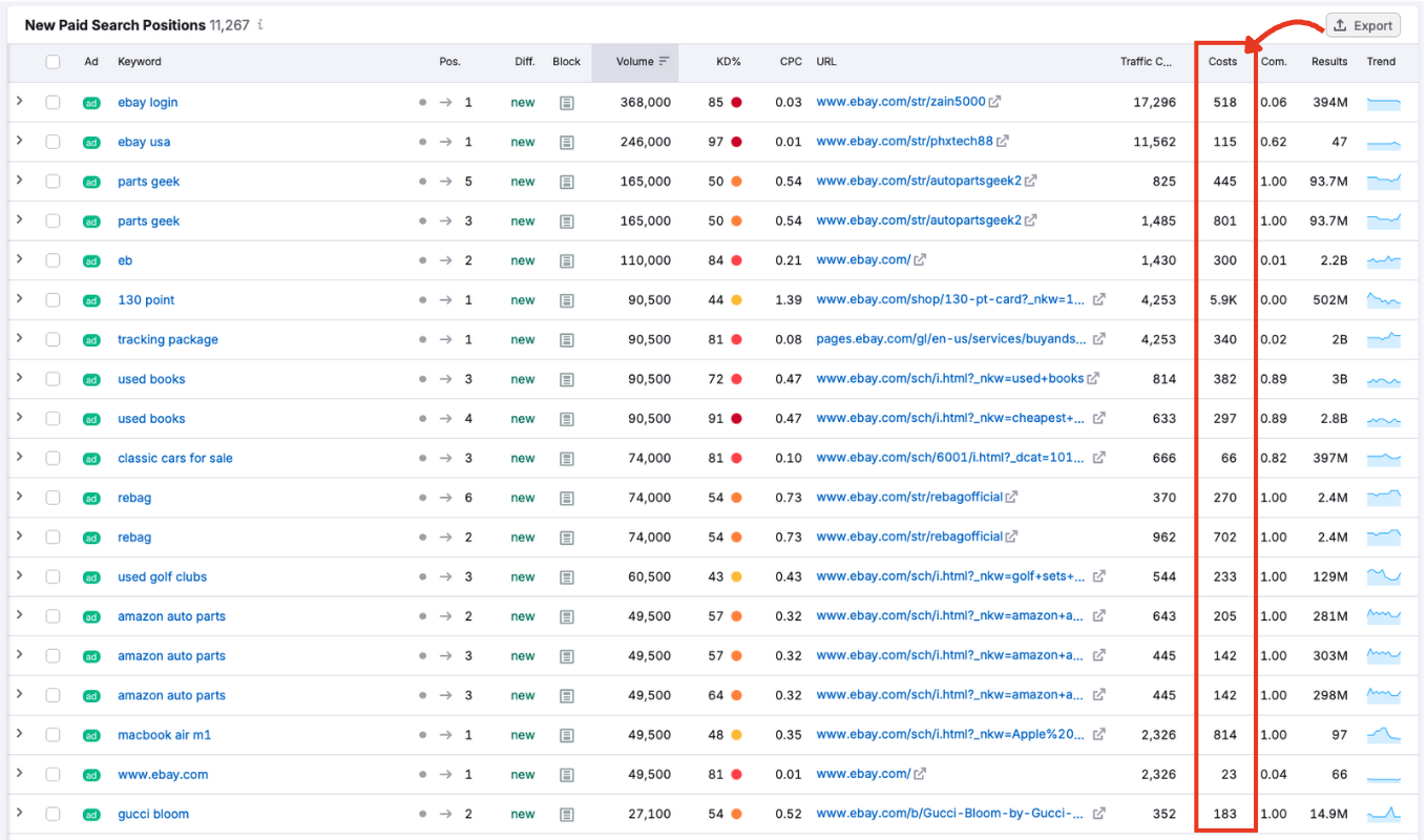
The estimated cost of generating traffic from this keyword. This helps you gauge the level of investment behind each term.
Com. (Competition)
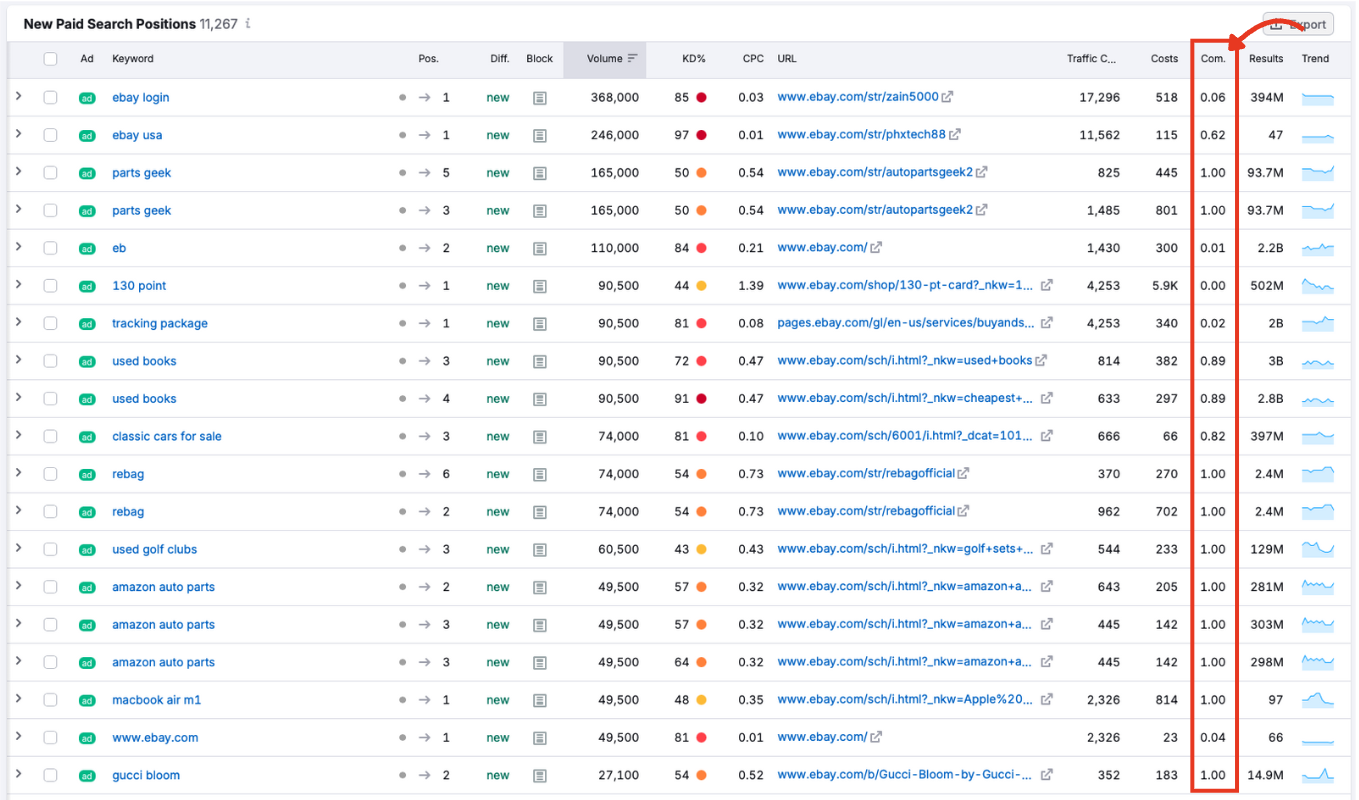
A value between 0 and 1 indicating how competitive the keyword is in the paid ad auction. Higher scores mean more advertisers are bidding on that term.
Results
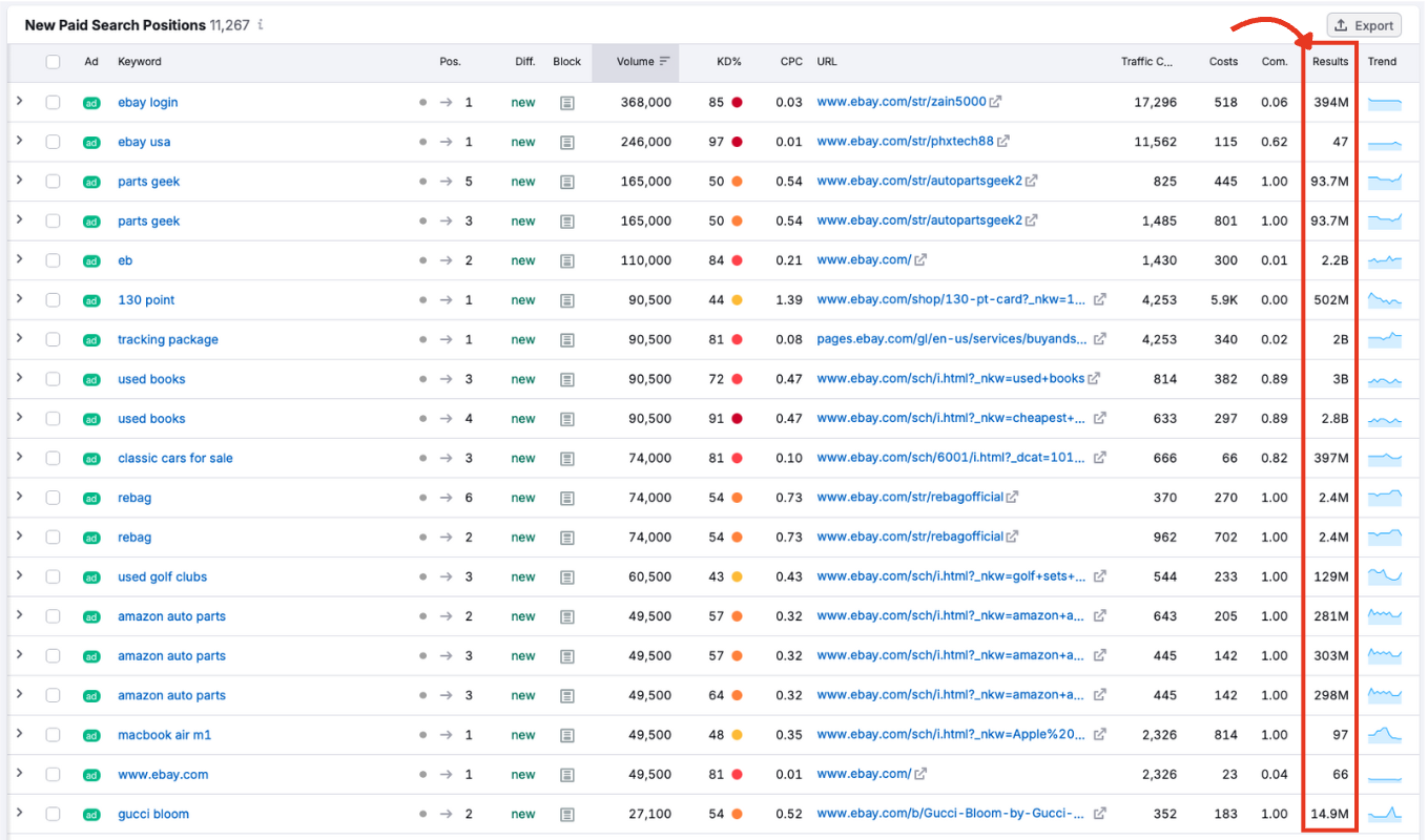
Displays how many results appear in organic results for the keyword. A high number signals saturated SERPs, while a low count may suggest easier positioning.
Trend
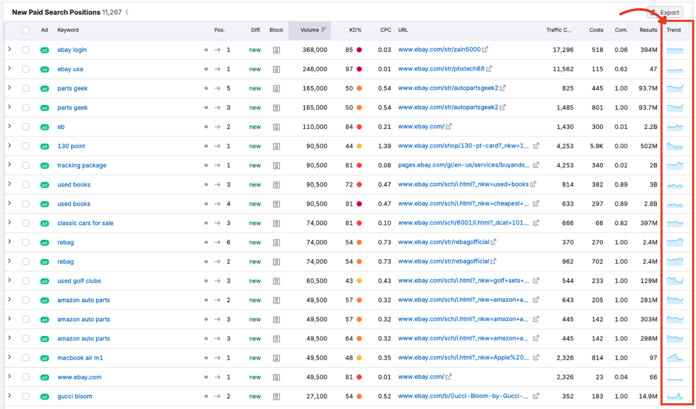
A small graph showing how search interest in the keyword has changed over the past 12 months. Use this to identify seasonal spikes or fading interest.
Bonus feature
Click anywhere on a row that’s not a link to expand into a graph showing that specific keyword over time, as well as a link to the ad landing page.
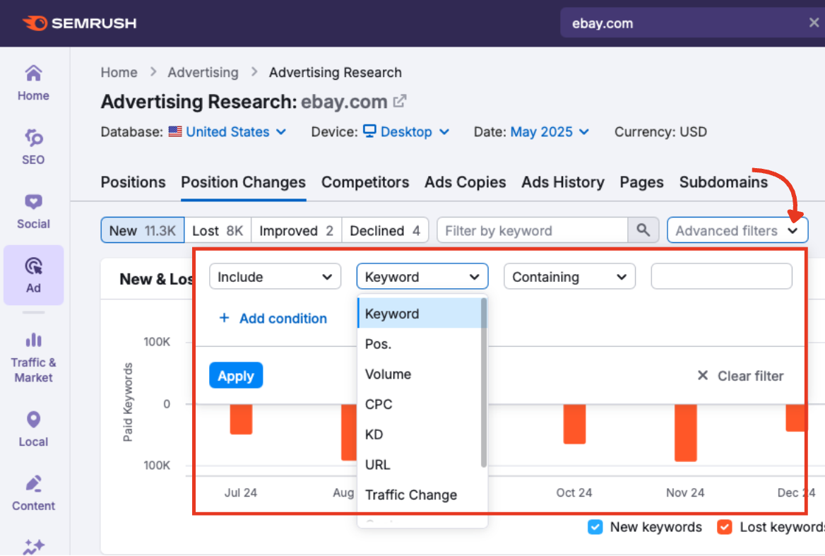
Sorting, Filtering, and Exporting
Click any column header that displays numerical values to sort the data (e.g., by CPC, volume, position, etc.)
Use the Filter by keyword or advanced filters menu to narrow results based on:
- Keyword
- Position
- Volume
- CPC
- Keyword difficulty
- URL
- Traffic change
- Costs
- Competition
- Results
Export the full table or selected rows using the Export button in the top right.

Choose from CSV, Excel, or CSV (semicolon).
Continue Building Your Advertising Research Strategy
The Position Changes within Advertising Research report is your key to understanding how paid search strategies evolve. By tracking which keywords are added, lost, or changing in position, you can uncover how competitors are allocating their budgets, testing new campaigns, or pulling back from specific search terms.
Once you’ve reviewed a domain’s keyword movement, your next step is the Competitors report. This tab shows who else is targeting the same terms, how aggressively, and where your domain stands in comparison.
Other Advertising Research tabs to explore:
- Positions: The first tab, which breaks down general keyword positions.
- Ads Copies: Analyze ad messaging and creative strategies.
- Ads History: Look back at ad activity over time.
- Pages: Discover which landing pages are earning the most traffic.
- Subdomains: See how paid visibility is distributed across subdomains.
You don’t have to follow each tab in order; just jump ahead to the report that best fits your goal. Each of these has its own manual to guide you step-by-step.
For a comprehensive look at your paid ads performance and management, see all the other tools within the Advertising Toolkit.